Dark Mode, a Not so Simple Story
Dark mode may seem like an easy feature to implement. From the point of view of a user, you click a button and things change color. However, appearances can be deceiving. If you stop and think of all the requirements for dark mode in detail, you'll soon realize that things are not so simple. There's also an interesting disconnect between implementing this feature in vanilla JS, and implementing it using a modern framework. In the latter, you'll run into cases where what you need to do is either unsupported or highly discouraged. In this article, I'll go into how I implemented dark mode for this website. I think you'll be surprised by the myriad of concepts involved in implementing such a seemingly simple feature, I know I was! There's definitely a lot to be learned from doing something like this yourself!
The Requirements
Let me begin by defining the requirements I had in mind when I wanted to implement dark mode:
- Clicking the dark mode button changes the website color theme between “light” and “dark”.
- When the dark mode button is clicked, the applied theme is persisted. This way if the user reloads the page, the chosen theme remains active (the user does not have to click the button again).
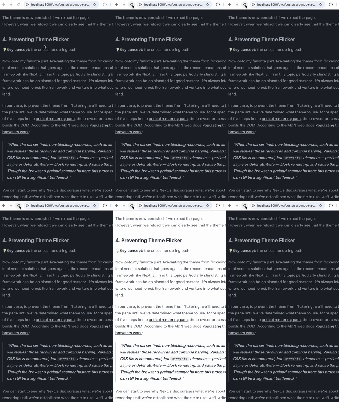
- If the user reloads the page there should not be any kind of flickering between themes.
- If the user has not interacted with the dark mode button, the user's system theme is used as default. And if the system theme changes, the website theme changes accordingly. Once the user interacts with the dark mode button, the system theme is not taken into account anymore.
My Tech Stack
Dark mode can be implemented in vanilla JS. However, the interesting bit is making it work the same way using a modern framework. I implemented this website using Next.js and its App Router. I use Tailwind CSS and Daisy UI to handle styling my website. In particular, Daisy UI lets me easily apply default themes to the entire website.
Implementing Dark Mode
1. Handling Themes With Daisy UI
💡Key concept: using a data-*
attribute to set a theme for the website.
If you're curious about following my implementation and you're using another library to handle your design system, Daisy UI isn't necessary. However, it does provide preconfigured themes and makes it really easy to apply any one of them to the entire website. In your tailwind config file you just need to specify:
daisyui: {
  themes: ["light", "dark"],
},
After that all you need to do is set the data-theme attribute on an element high up in the DOM with either the “light” or “dark” value.
I use “light” as the default fallback:
<html data-theme="light"></html>
Do this in the Next.js Root Layout to modify the initial HTML returned from the server for every page.
And you're done! This is all you need to apply a theme to your website. The real trick will be correctly switching between themes.
Note: whether you're using Daisy UI or not, you should have a way to switch between themes by simply specifying a value for a data-* attribute.
2. Switching Between Themes With a Button
💡Key concept: React Server Components vs. React Client Components.
Now that we have a way to easily apply different themes to our website, let's fulfill the first requirement I listed before: adding a button that allows the user to swap between themes.
As I mentioned earlier, when the user clicks on the button we want to change the data-* theme attribute on the <html> element. You might think of implementing a Component like this one:
import { Moon } from "lucide-react"

export const DarkModeButton = () => {
  const onClick = () => {
    const theme = document.documentElement.getAttribute("data-theme")

    document.documentElement.setAttribute(
      "data-theme",
      theme === "light" ? "dark" : "light"
    )
  }
  return <Moon onClick={onClick} />
}
Note: I'm currently using lucide-react for my icons. If you want the icon itself to
change color according to the current theme, you can specify a CSS class for the icon and then
set different colors for it according to the theme in your tailwind config file.
However, if you're using the App Router you'll run into a runtime error right away:
Error: Event handlers cannot be passed to Client Component props.
  <button onClick={function onClick} children=...>
                  ^^^^^^^^^^^^^^^^^^
If you need interactivity, consider converting part of this to a Client Component.
When using the App Router every Component is a React Server Component (RSC) by default, unless specified otherwise with the 'use client' directive.
I won't explain React Server Components in detail in this article,
but Josh Comeau wrote a great article, Making Sense of React Server Components,
which explains them very clearly. To make a long story short, React Server Components do not allow for interactivity.
Though they are new and may initially frustrate you with errors like the one above,
React Server Components are actually simpler versions of “regular” Components.
You can't use any useState or useEffect hooks in them. And seeing as they only render once,
they free you from some of the Rules of React since you'll never run into any re-render related issues with them.
In our case we need interactivity and therefore can't use a React Server Component for our button. We need “regular” React Components, now known as Client Components.
Simply adding the 'use client' directive at the top of the file above fixes the issue for us.
Now we can change the theme with a click of a button, but if you reload the page you'll see that the changes to the theme are lost…
3. Persisting the Theme Using Local Storage
💡Key concept: local storage.
In order to avoid losing changes to the theme, we must persist the theme in some way.
Using the window localStorage property makes this a breeze.
When the user clicks on the button, we store the name of the applied theme. And when the page loads,
we read from local storage and set the theme accordingly. Though as you'll see we'll quickly run into an important issue later on.
Let's create a hook called useThemeHandler() to encapsulate all of our
theme switching logic, which we can then call in our DarkModeButton Component.
The hook will:
- Call
useEffect()to handle reading from local storage and apply the current theme on page load. - Return a callback that handles switching and storing the theme,
which we can pass to the
onClickattribute of our<button>.
import { useEffect } from "react"

export const useThemeHandler = () => {
  useEffect(() => {
    const theme = localStorage.getItem("theme")

    document.documentElement.setAttribute("data-theme", theme ?? "light")
  }, [])

  return () => {
    const theme = document.documentElement.getAttribute("data-theme")

    const newTheme = theme === "light" ? "dark" : "light"

    document.documentElement.setAttribute("data-theme", newTheme)

    localStorage.setItem("theme", newTheme)
  }
}
Then our DarkModeButton will just be:
"use client"

import { Moon } from "lucide-react"
import { useThemeHandler } from "./useThemeHandler"

export const DarkModeButton = () => {
  const handleTheme = useThemeHandler()

  return <Moon onClick={handleTheme} />
}
The theme is now persisted if we reload the page. However, when we reload it we can clearly see that the theme flickers... 😱

4. Preventing Theme Flicker
💡Key concept: the critical rendering path.
Now onto my favorite part. Preventing the theme from flickering will force us to implement a solution that goes against the recommendations of an opinionated framework like Next.js. I find this topic particularly stimulating because while a framework can be opinionated for good reasons, it's always interesting to see cases where we need to exit the framework and venture into what seems like no man's land.
In our case, to prevent the theme from flickering, we'll need to block the rendering of the page until we've determined what theme to use. More specifically, during the first of five steps in the critical rendering path, the browser processes the HTML and builds the DOM. According to the MDN web docs Populating the page: how browsers work:
When the parser finds non-blocking resources, such as an image, the browser will request those resources and continue parsing. Parsing can continue when a CSS file is encountered, but
<script>elements — particularly those without an async or defer attribute — block rendering, and pause the parsing of HTML. Though the browser's preload scanner hastens this process, excessive scripts can still be a significant bottleneck.
You can start to see why Next.js discourages what we're about to do…
To block rendering until we've established what theme to use, we'll write a script to determine the theme to use and insert it at the very top of the <body> element in our Root Layout.
This is not possible using the Next.js <Script> Component. We'll also have to disable the @next/next/no-sync-scripts ESLint rule:
<body className="{inter.className}">
{/* eslint-disable-next-line @next/next/no-sync-scripts */}
<script src="/theme.js" />The script itself is very simple and does the same thing we were doing in the useThemeHandler hook's useEffect:
;(function initTheme() {
  const theme = localStorage.getItem("theme")

  document.documentElement.setAttribute("data-theme", theme ?? "light")
})()
We're wrapping the script in an IIFE in order for it to execute immediately. And now, no more flickering! 🥳
Note: with the current implementation, if you open your DevTools you'll see an interesting error.
Warning: Prop `data-theme` did not match. Server: "dark" Client: "light"
at html
at RootLayout (Server)
at RedirectErrorBoundary (
Next.js pre-renders our application's React tree on the server so that our browser may receive pre-rendered HTML. As is stated in the documentation for the Text content does not match server-rendered HTML error:
Hydration is when React converts the pre-rendered HTML from the server into a fully interactive application by attaching event handlers.
When there is a difference between the React tree pre-rendered on the server and the React tree following Hydration, Next.js shows us this error.
In our case this makes sense because in our Root Layout, which defines initial HTML returned from the server for every page,
we specified “light” as the default value for the html elements's data-theme attribute. But when the user chooses dark mode and our render-blocking script runs,
that attribute changes, causing a difference in the React trees.
Fortunately we can easily silence this error by adding the suppressHydrationWarning attribute to our html element.
5. Respecting the User's System Theme Preference
💡Key concept: the Window interface's matchMedia() method.
We basically completed dark mode, but one improvement could be to set the initial theme according to the user's system preference. So in case the user hasn't interacted with the dark mode button, therefore not communicated a preference between the light or dark themes; we can begin by setting the theme to match the user's system theme instead of always defaulting to “light”.
We'll use the prefers-color-scheme: dark media query to detect if the user requested light or dark color themes.
Thankfully this is easy to do in JavaScript using the Window interface's matchMedia() method. In our render-blocking script, if there is no stored theme, we can set it to dark mode if the user requested it:
const prefersDarkColorScheme = matchMedia(
  "(prefers-color-scheme: dark)"
).matches

if (prefersDarkColorScheme) {
  document.documentElement.setAttribute("data-theme", "dark")
}
For additional polish, we can add an event listener to the media query list returned by the matchMedia() method:
window
  .matchMedia(`(prefers-color-scheme: dark)`)
  .addEventListener("change", ({ matches }) => {
    if (localStorage.getItem("theme")) {
      return
    }

    applyTheme(matches ? "dark" : "light")
  })
This way if the user still hasn't interacted with the dark mode button but changes the system theme while our website is open, the website's color scheme will change when the system theme also changes.

My final render-blocking script looks something like this:
;(function initTheme() {
  const storedTheme = localStorage.getItem("theme")

  const applyTheme = (theme) => {
    document.documentElement.setAttribute("data-theme", theme)
  }

  if (storedTheme) {
    applyTheme(storedTheme)

    return
  }

  window
    .matchMedia(`(prefers-color-scheme: dark)`)
    .addEventListener("change", ({ matches }) => {
      if (localStorage.getItem("theme")) {
        return
      }

      applyTheme(matches ? "dark" : "light")
    })

  const prefersDarkColorScheme = matchMedia(
    "(prefers-color-scheme: dark)"
  ).matches

  prefersDarkColorScheme && applyTheme("dark")
})()
While my useThemeHandler() looks like this:
import { useCallback } from "react"

type Theme = "light" | "dark"

const applyTheme = (theme: Theme) => {
  document.documentElement.setAttribute("data-theme", theme)
}

const getStoredTheme = () => localStorage.getItem("theme")

const storeTheme = (theme: Theme) => localStorage.setItem("theme", theme)

export const useThemeHandler = () => {
  return useCallback(() => {
    const storedTheme = getStoredTheme()

    if (storedTheme) {
      const newTheme = storedTheme === "dark" ? "light" : "dark"

      applyTheme(newTheme)

      storeTheme(newTheme)

      return
    }

    const prefersDarkColorScheme = matchMedia(
      "(prefers-color-scheme: dark)"
    ).matches

    const newTheme = prefersDarkColorScheme ? "light" : "dark"

    applyTheme(newTheme)

    storeTheme(newTheme)
  }, [])
}
Note that the last lines of the hook handle the case where the user clicks on the button but the new theme to apply may not be the default light color scheme
since we are now reacting to the prefers-color-scheme: dark in our render-blocking script.
And that's it, we now have a robust and polished dark mode feature on our website! 🎉
To keep things relatively simple, I left out some logic from the above script and hook. But below I'll discuss how you can handle that yourself if you feel so inclined. 🙂
6. Bonus Points
Without going too much into detail I wanted to mention two additional cases you might want to be aware of if you're implementing dark mode yourself.
Supporting Syntax Highlighting
In case you haven't noticed yet, when you switch the theme on my website the syntax highlighting for the code blocks changes. This is simple enough to do, you just need to include the stylesheets for each theme in your Root Layout.
What you may not know is that you can disable any one of the stylesheets programmatically with the HTMLLinkElement: disabled property:
Setting the disabled property using JavaScript causes the stylesheet to be removed from the document's Document.styleSheets list.
Setting the User Agent UI Color Scheme
This is an edge case that I noticed is not even handled in theme-change , which Daisy UI recommends in its documentation for handling switching themes.
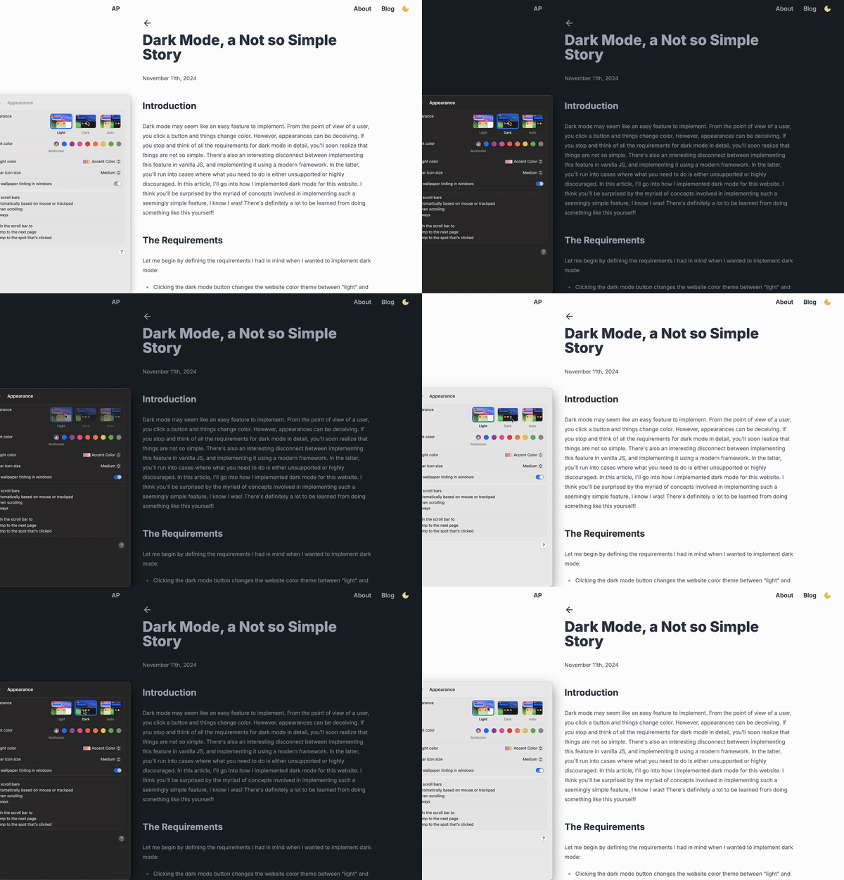
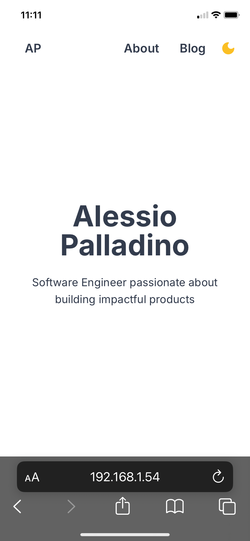
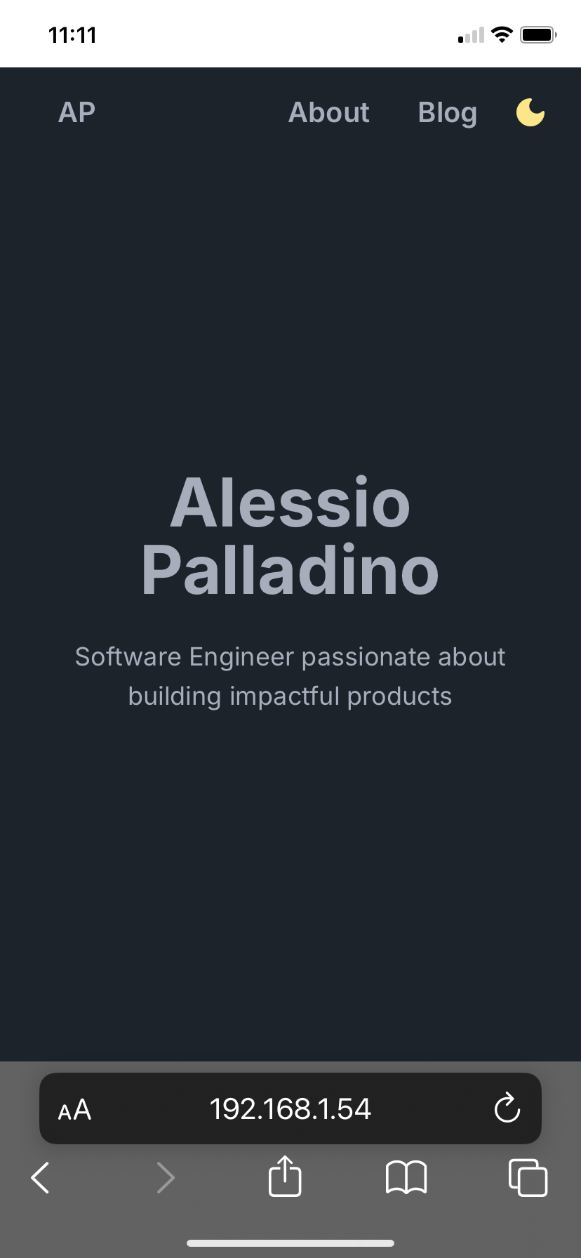
Some browsers allow theme colors to be set on the user interface surrounding the page. When switching themes programmatically like we are, this theme color is not updated the same way. What results is a visible bug where our website displays the correctly selected theme while the surrounding UI is still displaying the previous color scheme. Refreshing the page correctly updates the UI, but that's not good enough for us!
Below you can see an example of what I mean. In the first screenshot you see the correct light color scheme. However when I click on the dark mode button the website theme correctly changes but the surrounding browser UI (visibly the status and address bar areas) is still using the "light" color scheme. In the last screenshot I reloaded the page and the dark theme is correctly displayed.


You can fix this by specifying a <meta> element with
name="theme-color" and some id. Then programmatically set the content attribute with
the desired color when switching themes. As stated in the documentation,
theme-color:
indicates a suggested color that user agents should use to customize the display of the page or of the surrounding user interface.
In my Root Layout I included this <meta> element in the document <head>:
<meta id="meta-theme-color" name="theme-color" />
Then in the useThemeHandler() hook, when applying a theme, I do this:
import { dark, light } from "daisyui/src/theming/themes"

const applyTheme = (theme: Theme) => {
    document
      .getElementById("meta-theme-color")
      ?.setAttribute(
        "content",
        theme === "dark" ? dark["base-100"] : light["base-100"]
      )
Conclusion
Were you expecting all these different concepts to come up just to implement dark mode? I know I wasn't. From the pre-rendered HTML generated by the server, to the render-blocking script interrupting the browser's critical rendering path, to the diffing of React Trees during Hydration, and the use of React Client Components to handle stateful interactions on the client using Next.js's App Router; there are quite a lot of layers involved. Thankfully these concepts are useful to understand, which is why I think there's a lot to learn from implementing a “simple” feature like this one and making it robust and polished. There are third party libraries that handle dark mode for you, but this is one of those cases where instead of working on a project where you try reinventing the wheel; you can simply learn a lot by understanding how the wheel works.